Bridging Heritage and Athleticism Through Strategic Identity
The Challenge
The Philadelphia Jewish Sports Hall of Fame (PJSHoF) faced a common hurdle for legacy organizations: a visual identity that had fallen behind the digital age. Their original logo lacked the scalability and legibility required for a modern web presence, hindering their professional image online. They didn’t just need a “new look”—they needed a cohesive brand system that could command respect at a gala while remaining crystal clear on a smartphone screen.
The Strategy: Concept & Soul
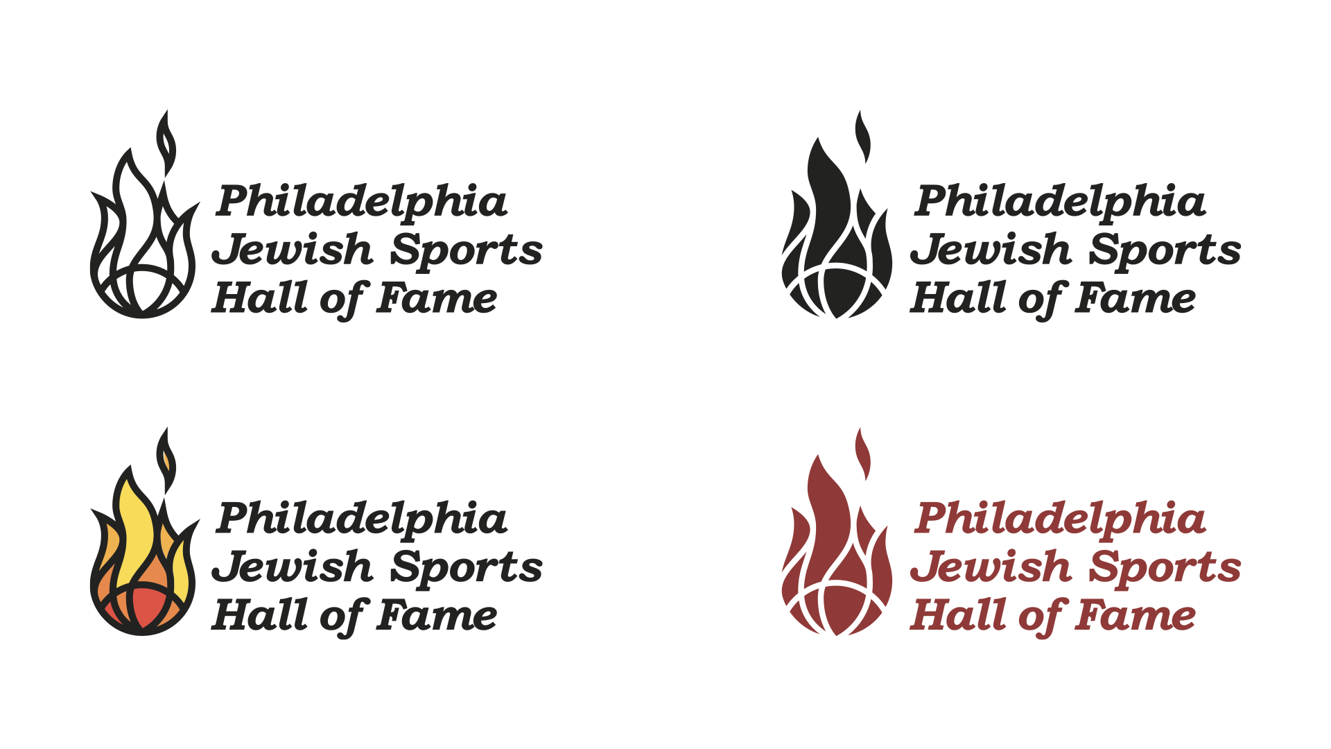
I began the process by identifying the core “soul” of the organization. based on our original discussions, I pivoted away from generic sports imagery to focus on the Flame—a powerful symbol of divine presence, sanctity, and hope in Judaism.
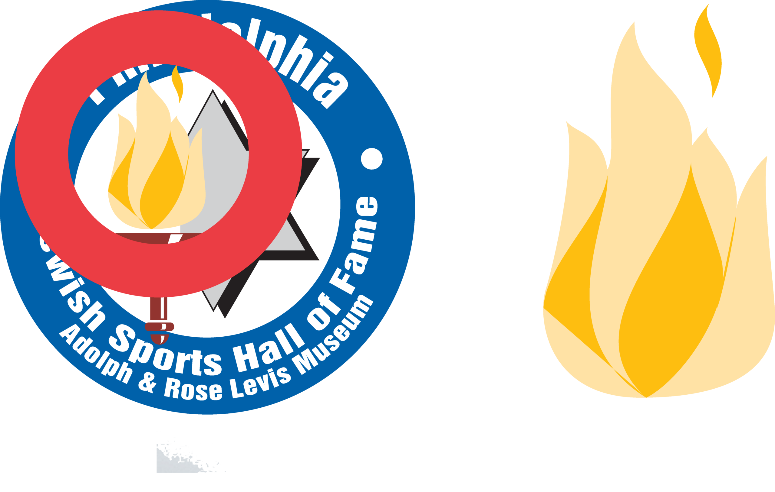
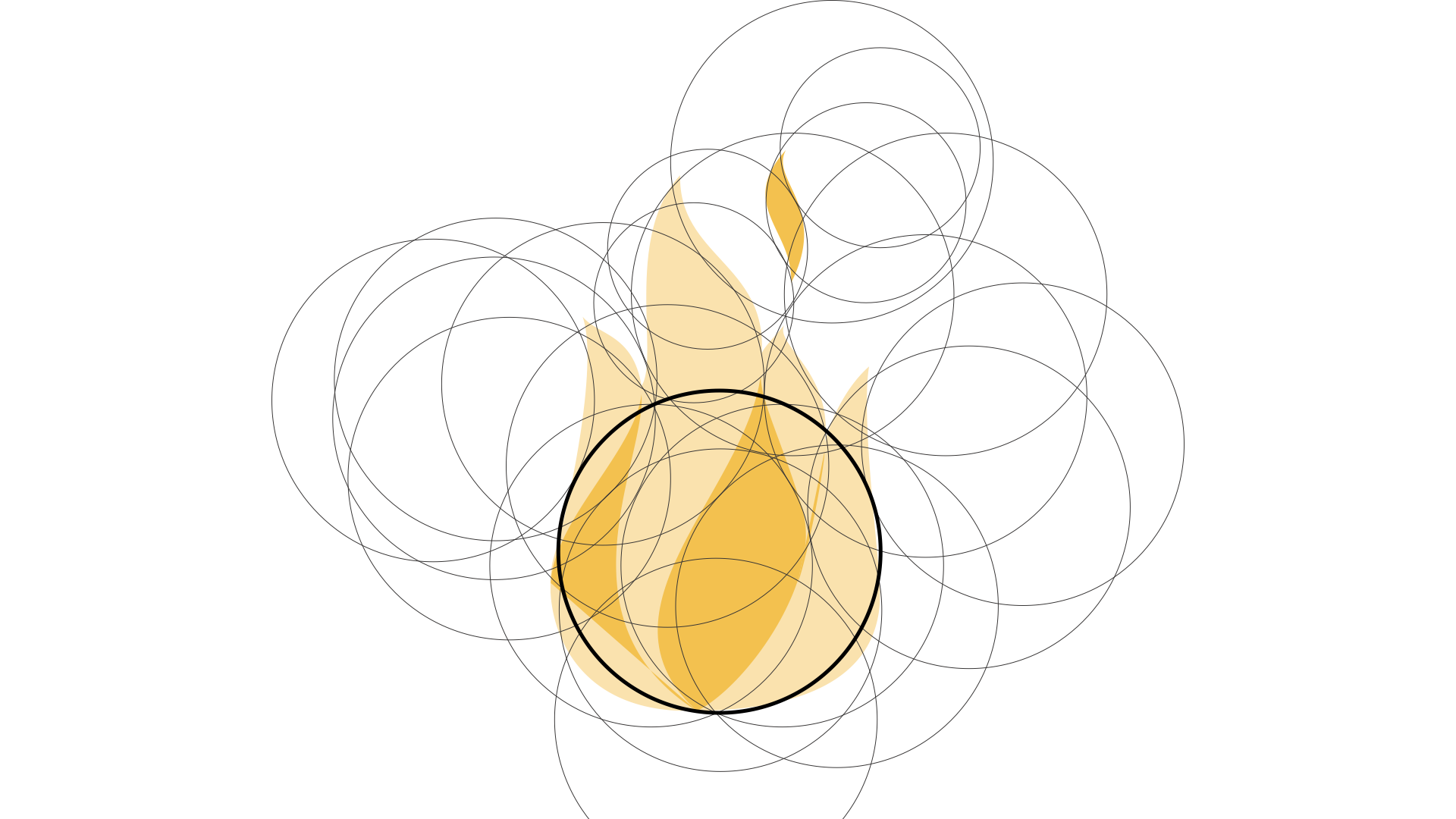
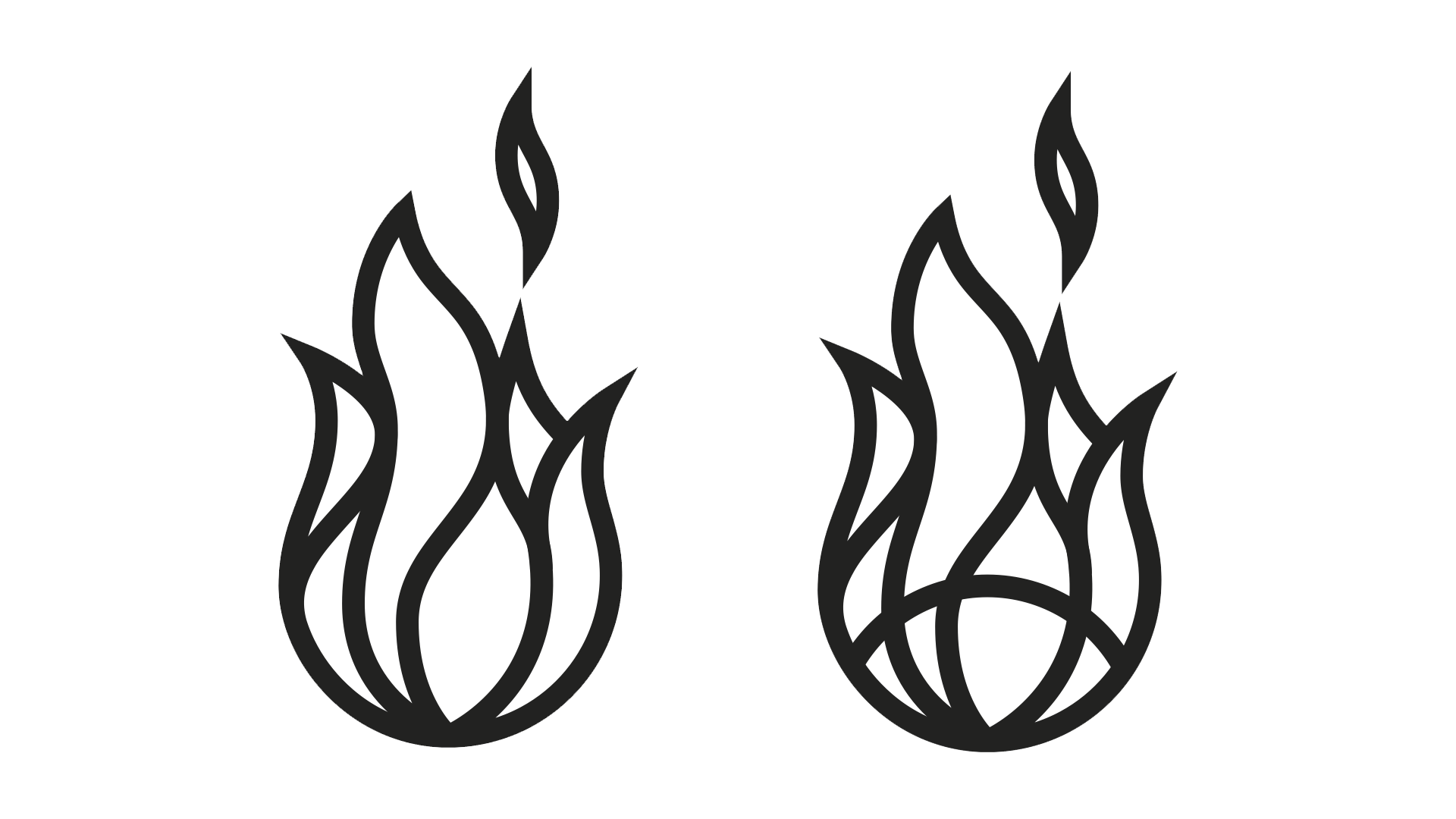
Rooted in the biblical command of the Ner Tamid (the eternal light), the flame represents the spiritual light that the Hall of Fame’s inductees have spread through their athletic achievements. To differentiate the PJSHOF from other Jewish organizations that use flame motifs, I applied a rigorous mathematical approach using the Golden Ratio. This ensured every curve and proportion was perfectly balanced, creating a unified and timeless mark.

The finishing touch was to add the semicircle to the bottom would bring in a sports feel, mimicking the shapes seen in basketball, baseball, football, tennis, etc…
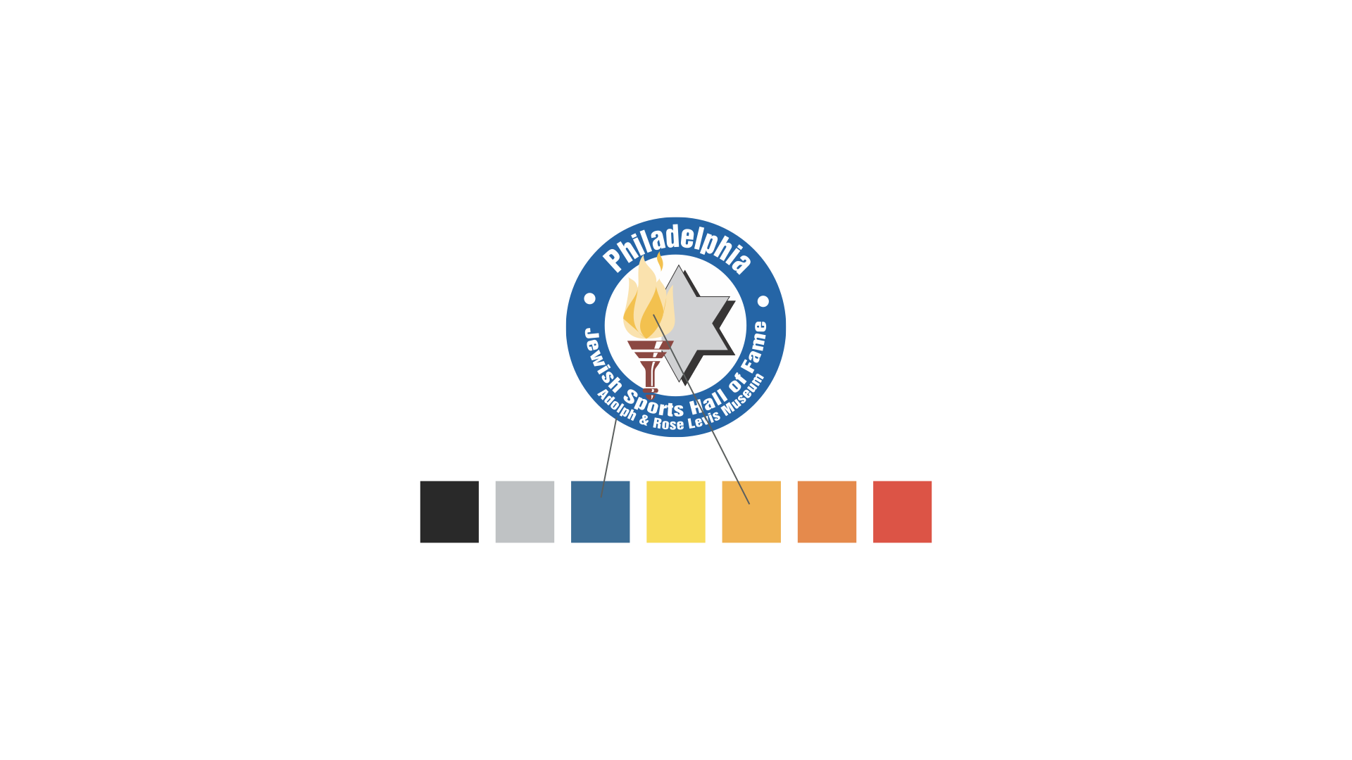
To identify colors, I pulled the colors from their existing logo so the brand transition would feel familiar to existing patrons.
Designing for “Place”
To tie the identity specifically to Philadelphia, I conducted deep-dive research into the city’s history, exploring Philadelphia’s Jewish-owned type foundries from the city’s founding. This led to the selection of Bookman Old Style.
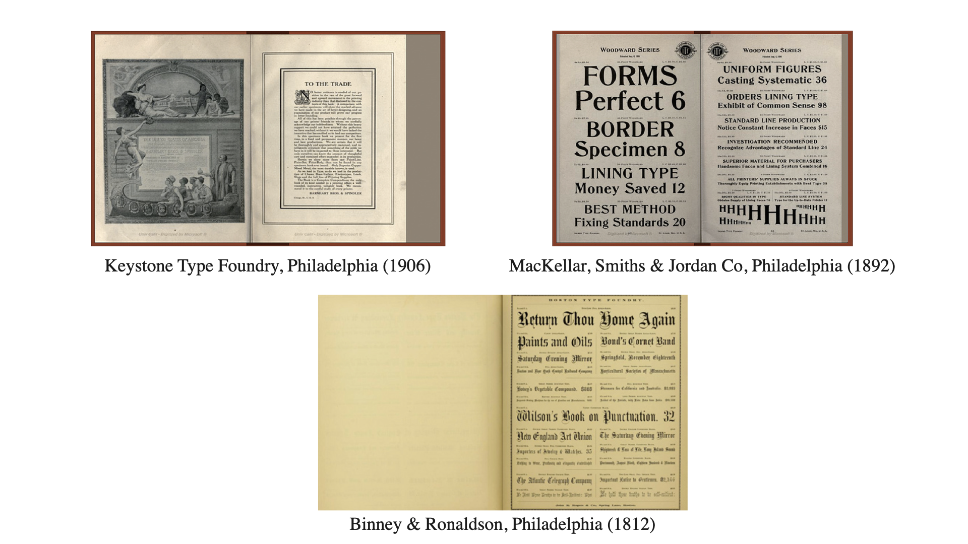
Bookman is not only a workhorse for legibility at small sizes, but it shares a direct lineage with the typography used by the Philadelphia 76ers, creating an immediate, subconscious link between Jewish heritage and the city’s professional sports culture.
The Result: A “Stained Glass” System
The final identity is a synthesis of tradition and modern performance:
- The Mark: A flame icon built on Golden Ratio geometry, cradled by a semicircle that mimics the shapes found in basketball, baseball, and football.
- The Palette: I modernized the organization’s existing colors and applied a “stained glass” effect, nodding to the iconic windows found in synagogues.
- The Impact: The result is a sleek, modern look that honors traditional values.
The Client’s Perspective
The PJSHoF board was deeply involved in the journey. While they initially sought a redesign for readability, they discovered the power of brand strategy. As one representative noted, they never could have expected the level of conceptual research and historical depth required to create a truly unique and professional identity.
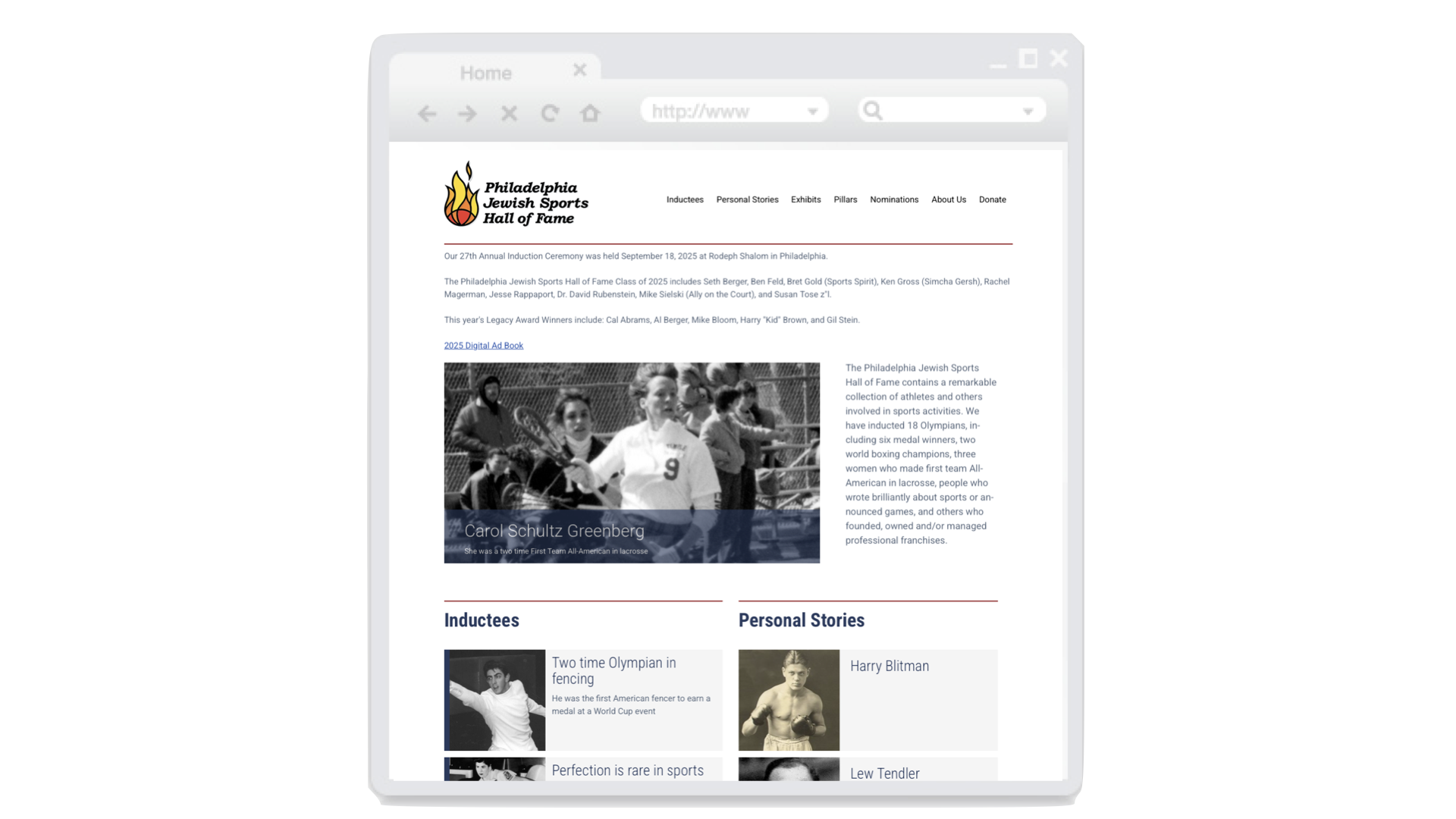
The new system was put to the ultimate test during their annual gala, where benefactors noted the profound shift in the organization’s professional appearance. What began as a web accessibility project transformed into a powerful tool for fundraising and community pride.